Smart CTAs: Why & How To Create Them In HubSpot
Do you ever wish you could offer lead-generation resources specifically tailored to the preferences and current context of the readers that are visiting your website? Are you frustrated that you are potentially missing out on conversion opportunities because your visitors see CTA buttons that they have already converted on or are irrelevant to them?
You are not alone. Personalization on websites is becoming increasingly crucial for businesses looking to maximize customer engagement and conversion rates. Statistics show that 90% of consumers find personalization appealing and that nearly 75% of customers are more likely to purchase from a website that offers tailored recommendations. Furthermore, it has been estimated that personalized content results in a 19% increase in sales.
In this blog post, we will cover:
- 3 Types Of Call-To-Action (CTA) Buttons In HubSpot
- What You Need To Know About Smart CTAs With HubSpot
- How To Create Smart CTAs With HubSpot
- Call-To-Action Related FAQs
Let's get started.
3 Types Of Call-To-Action (CTA) Buttons In HubSpot
A Call-To-Action (CTA) button is an interactive feature that encourages readers or viewers to take a specific course of action. It is an essential element of inbound marketing, enabling businesses to measure their conversions and results more effectively.
CTA buttons are typically placed prominently within content and text, and they use persuasive language that encourages readers to click the button, such as “Learn More” or “Sign Up Now.”
HubSpot offers three types of Call-To-Action buttons: a simple CTA, multi-variant CTAs, and smart CTAs. Each has its pros and cons and should be used as part of a strategic inbound marketing plan.
Simple Call-To-Action Buttons
A simple CTA can either be a custom button or an image button that, once created, can be embedded into a website page, blog post, or email. It will show up the same way to everyone who visits the page.
Multi-Variant Call-To-Action Buttons
A multi-variant CTA is an interactive feature that presents different variations of a CTA button to users on the same page. In other words, different visitors will be shown variations (e.g., changes in button color, copy, image, and/or design) of the one CTA to test which combination performs better. This allows businesses to measure how users respond differently to each variation and determine which yields the highest conversion rate.
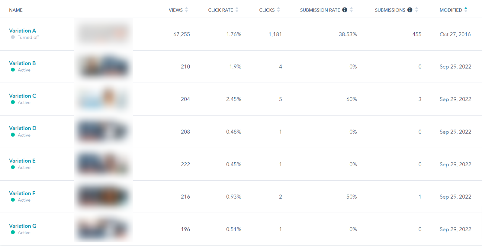
Smart Call-To-Action Buttons
A smart CTA is an interactive feature that dynamically changes its content and layout based on the visitor’s behavior. This helps to present the right offer or message at the right time, making it more likely that users will complete the desired action, such as clicking the CTA button.
Smart CTAs can be highly effective at driving conversions, as they are tailored specifically to each user’s individual needs, while also allowing businesses to track results in real time. They also offer a way for businesses to engage more effectively with their audience, as the business can tailor its content specifically to the audience's needs.
For example, you can design an alternative CTA for visitors who have already downloaded or acted upon the first offer. Today, I will walk you through how to create a Smart CTA using HubSpot.
What You Need To Know About Smart CTAs With HubSpot
With HubSpot Marketing Hub Professional or Enterprise as well as HubSpot CMS Hub Professional or Enterprise, you can create Smart CTAs using the following segmentation criteria:
- Country (determined by the visitor's IP address),
- Device type (mobile, tablet, or desktop based on the visitor's browser user agent; caution: this isn't always accurate),
- Referral source (determined by the previously visited URL that led this visitor to your website),
- Preferred language (based on the language stored in their browser),
- Contact list membership (defined by whether or not this visitor is part of a particular list in your HubSpot database), and
- Lifecycle stage (determined by the HubSpot lifecycle stage a visitor has, if any).
Think about what you want to do and how you want to accomplish this. For example, we have created smart CTAs for the following scenarios:
- For a website that offered a trial of the therapeutic training program to stroke and TBI patients who encountered vision problems, we redirected mobile users to a page that told them the trial wasn't available on a mobile device (due to visibility issues) and that a link would be sent to their email instead. Before this smart CTA, visitors started the trial on a mobile device and were frustrated because it didn't work.
- For a website that had a few resources in multiple languages, we offered smart CTAs based on the preferred languages.
- If a client has a series of lead generation offers that are built on each other, we would offer the next resource in the series to those visitors that had already downloaded the previous one.
How To Create Smart CTAs With HubSpot
Step 1: Navigate to CTAs. To get started with creating a smart CTA, navigate in your HubSpot portal to Marketing > Lead Capture > CTAs. If you have an existing simple CTA button you wish to make smart, go to the next step. If you do not yet have a CTA, you need to create a simple CTA by clicking on the orange "Create CTA."
.png?width=1811&height=570&name=Reports-dashboard%20(24).png)
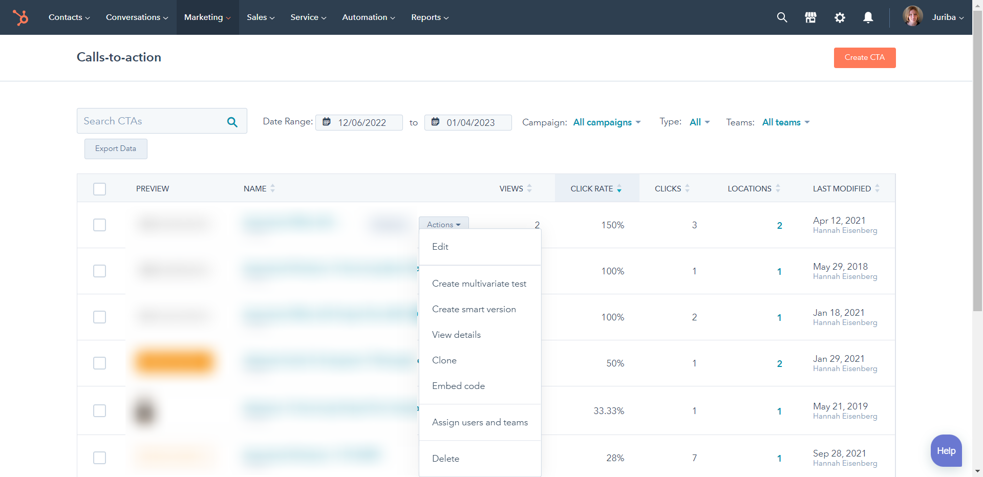
Step 2: Create a smart version. Hover over the CTA you want to make contextual, and two grey buttons will appear. Click on the "Actions" button, and a drop-down menu will show up. Click "Create smart version."
Step 3: Define the rules. The box below will pop up. Now you need to decide what set of rules you would like to apply to your CTA. These are the criteria mentioned above, such as country and list membership. By choosing one, options will appear below the six option boxes. For example, if you choose Contact's list membership as a criterion, HubSpot will offer you the opportunity to choose one or many lists as the second step.
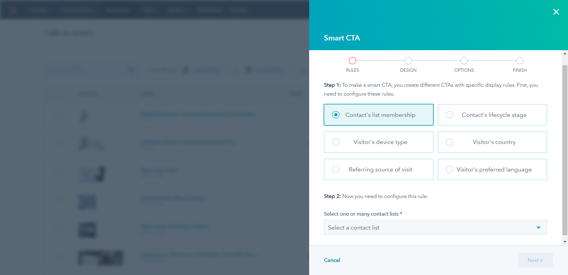
Step 4: Upload your smart CTA. Configure your rule by following the instructions relevant to each criterion. When you have chosen the appropriate options, click the orange "Next" to upload the Call-To-Action button you wish to use for the audience you just selected.
Step 5: Configure and save. Once you have uploaded your new CTA, you can configure it by changing the name, URL, campaign, etc. When done, simply hit save.
Please note: You will need to create variations for each different smart CTA. In other words, if you want to create a Spanish, German, and Italian version in addition to the default English CTA (that would be your simple CTA), you will need to create three additional versions, one for each language.
Step 6 (optional): Test your smart CTA. For HubSpot-dependent criteria (lifecycle stage or list memberships), you can test it by previewing a page with that new Call-To-Action button on it and choosing a contact that fulfills the conditions (e.g., has the lifecycle stage you are looking for). For location-based criteria, you could visit your page with a VPN switched to a different location.
Conclusion
For businesses to remain competitive, personalizing websites with relevant, timely information is essential. By leveraging customer data and tailoring experiences to each user’s needs, businesses can create an engaging, enjoyable experience that leads to increased customer satisfaction and loyalty. Smart Call-To-Action buttons are simple, yet effective ways to increase conversion rates, enrich your users' experience, and improve the quality of the leads coming in.
If you don't have HubSpot yet, give it a whirl with our free 30-day trial. We will set it up for you and show you around, with no strings attached.
Call-To-Action Related FAQs
Where should I place my CTA button?
When it comes to deciding where you should place your CTA button, there are a few key considerations. Firstly, you want your CTA button to be easily visible and easy to click on. This means placing it high enough up in your content that it stands out from the rest and ensures users can navigate to it quickly. Secondly, you should ensure that the placement and styling of your CTA do not disrupt the flow of the user experience. An example of this disruption would be if your CTA interrupts the reading flow or if users need to scroll away from the relevant section before finding it.
How do I create effective Call-To-Action buttons?
Creating effective CTA buttons starts with crafting persuasive copy that motivates people to take action; this could be words like "Start Free Trial" or "Download Today." Consider also using colors and graphics that stand out from surrounding elements. This will help draw attention to the CTA when it is seen in comparison with other elements on the page. Additionally, make sure all fields required for completion are clear and obvious, and avoid asking for unnecessary information which may discourage users from completing their action.
What are the different types of CTA buttons?
There are several types of CTA buttons commonly used in Inbound Marketing. Each type has different mechanisms devoted to achieving various goals set by businesses:
- Lead Generation CTAs - focus on collecting data about leads such as name, email address, etc., usually requiring them to fill out a form in exchange for some sort of resource/offer
- Social Sharing CTAs - explicitly designed for motivating social media sharing actions
- Call-To-Action Buttons - used on product pages geared towards directing customers to make purchasing decisions
- Clickable Ads - focused primarily on driving traffic towards specific websites/pages related to products or services
How can I measure the performance of my CTA buttons?
Measuring the performance of CTAs allows businesses to analyze how successful these elements were at engaging users and capturing leads. There are several metrics available that indicate conversion rates such as clicks per post or views per unique visitor, allowing businesses to monitor how effective specific campaigns are at driving conversions overall.
Share this
You May Also Like
These Related Stories

How To Create A Thank You Page In Minutes Using HubSpot
3 Scary Stories Your Call To Action Buttons Are Telling You

.png?width=250&height=125&name=TrustBuilderLogoWhiteTranspBackgr(250x125%20px).png)


No Comments Yet
Let us know what you think