.png?width=250&height=125&name=TrustBuilderLogoWhiteTranspBackgr(250x125%20px).png "TrustBuilderLogoWhiteTranspBackgr(250x125 px)")

There is no question: Marketers understand the importance of creating quality content in their lead generation: According to the Content Marketing Institute, the average B2B marketer allocates 28% of their total marketing budget for content marketing. 53% of marketers say blog content creation is their top inbound marketing priority. (Source)
However, if you are spending so much energy, money, and time on creating quality content every month, shouldn't you make sure that your content actually converts into leads?
Today's marketers don't have a Card Blanche anymore. They are held accountable by their CMOs and CFOs to show a measurable return on investment! The sales teams are asking for a service level agreement between them and marketing to guarantee a certain number of warm prospects for them to follow up with.
Yet, the single biggest oversight that I see on company blogs today is the lack of a well-designed and optimized call to action - the very thing that allows visitors to take the next step, raise their hand to indicate interest, and download a resource.
A/B Testing Allows You To Quickly & Easily Optimize Your Call-To-Action Buttons
The simplest and most effective way to measure the performance of your CTA buttons is your Click-Through-Rate. Once you identify poor-performing ones, you can use A/B testing to test different variations and zoom into peak performing ones.
Even though, creating an A/B test takes only a few minutes, only 44% of marketers employ A/B testing to measure the effectiveness of their work. Shouldn't be more 100%? Why wouldn't you check if a green button performs better then a red, yellow of blue button? The answer is simple: Many marketers think of A/B Testing of something highly technical.
Not only because of the technical sounding name that often scares off a lot of marketers — but also because of the results that you might find. They are afraid that they will have to fight an uphill battle to learn a new tool and methodology.
So, instead of going into a whole technical how-to tutorial or a "why your really should use A/B Testing to find the most effective CTA buttons" rant, I thought I would share with you three real stories that CTA buttons would tell you if they could talk:
1) "I am not noticeable enough!"
One of the biggest mistakes I see marketers make is to create call-to-action buttons that blend in with the rest of the website. If your site background is white and your primary accent color is blue, your readers might overlook a button that perfectly ties in with the rest of the site without even noticing it. In the example below, we created the same CTA, but in two color variations: Blue and white.
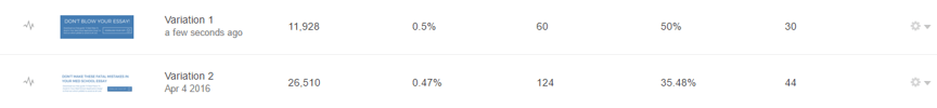
As you would expect, the blue one performed better than the white. While the Click-Through-Rate wasn't much higher, the conversion rate was, generating 50% more leads than the white one.
2) "I am confusing your readers!"
One of our clients has a blog that gets a tremendous amount of traffic, but it converts very little of it into actual leads. They were very diligent to place beautiful call-to-action buttons under each blog post, but only 0.58% of the visitors clicked on the button to see what's behind it. Once they got to the landing page, only 16.67% filled out the form. The eBooks were expert advice, and they aligned with the prospect's needs and their stage in the buyer's journey. So what was the issue then?
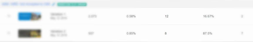
We ran an A/B test with an entirely different style of CTA. The old CTA only had the headline, a colorful background and an image. While the design was beautiful, it didn't say that you can click here to download a free (and valuable resource).
By switching to a CTA that not only enticed the reader to click by adding a button saying "Download" but also offering additional information of what to expect, we were able to not only get 0.85% of the visitors to click through to the landing page but also 87.5% of them filled out the form!
While this seems insignificant, it adds up! If both CTAs were seen by 2,000 people, the first only generated 1.9 leads, while the second scored 14.9 contacts. That is a 683% increase!
Now, deploy that across your entire blog, and you will see a significant increase in leads.
3) "I am not scary enough!"
We all experienced this "Oh, shoot..." moment in our lives where someone says something or you read something (I hope that this blog post is one of those moments) and you say to yourself: "Oh no, something has to change. And quickly. I have to do this or this to fix this!". In the CTA below we deployed that method. The eBook was entitled 5 Fatal Flaws [...], but the CTA just named the title and nothing else other than a "Download Instantly."
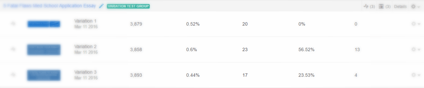
We created two variations to test: One that used the title added a short line of description and a enticing button visitors to download the asset. The second one was a bit stronger worded and directly addressed the buyer persona's biggest fear: to blow it! A lot hinged on it for them not to blow it, so we wanted to try out. They reaction was incredible.
While to old CTA button had a click-through-rate of 0.52% (first in the screenshot above), the "Don't Blow It" had a 0.6% CTR. However, the biggest difference was the mindset of the visitor seeing the landing page. While none of the visitors who clicked on the first one filled out the form, 56.52% of people became leads after having read the scary headline. This generated 13 leads, whereas the old one converted none what-so-ever.
Next Steps For You
It's not always easy to see why some things perform better than others.
Thankfully, you can use HubSpot's Call-To-Action tool or many other A/B Testing tools to measure the effectiveness of your buttons and then improve upon them. Find your top three performing blog posts and give it a try. Depending on your traffic numbers, you might need to give it a week or two to collect enough data - but eventually, you will start to see a pattern.
And if you need help, just let me know:
Share this

Smart CTAs: Why & How To Create Them In HubSpot
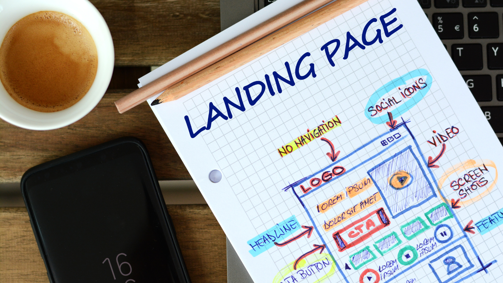
16 Best Practices To Create High-Converting Landing Pages in 2023

No Comments Yet
Let us know what you think