16 Best Practices To Create High-Converting Landing Pages in 2023
Creating a high-converting landing page in 2023 requires careful planning and execution. As technology evolves, so do best practices for creating effective web pages that capture leads or convert sales.
To help you succeed with your online marketing strategy, here are the 16 best practices that will help you create high-converting landing pages in 2023. From optimizing design elements to leveraging A/B testing strategies, this guide will show you how to create a compelling experience for customers who visit your website and ensure it meets all the latest B2B technology marketing standards. With these expert insights, crafting an engaging and successful landing page is within reach!
- Optimize Your Landing Page Design
- Create Compelling Copywriting
- Make Mobile Responsive Design a Priority
- Leverage A/B Testing to Improve Performance
Optimize Your Landing Page Design
Good landing page design is essential for a successful digital marketing strategy. Visuals can be used to draw attention and engage viewers, while keeping the design simple helps to avoid overwhelming visitors with too much information. White space should be incorporated effectively to help guide the user’s eye through the content and make it easier to read. Relevant calls-to-action (CTAs) should also be included throughout the page to encourage users to take action. Finally, different layouts and colors should be tested to determine which combination yields the best results.
Utilize Visuals. Images, videos, infographics, GIFs — these visuals can help capture a viewer’s attention quickly and increase engagement with your content. When selecting visuals for your landing page, try using ones that are relevant or related directly to what you are offering on that particular page so that they don’t distract from its purpose or message.
Limit the number of elements on the page. Too many elements on a single landing page can overwhelm visitors and cause them confusion or frustration when trying to find what they need quickly, which could lead them away from taking any desired action at all. Keep things as straightforward as possible by including only necessary components such as text boxes for inputting information or buttons for clicking through pages/sections of content instead of adding extra features like animations or popups that may not even serve any real purpose other than providing a visual distraction.
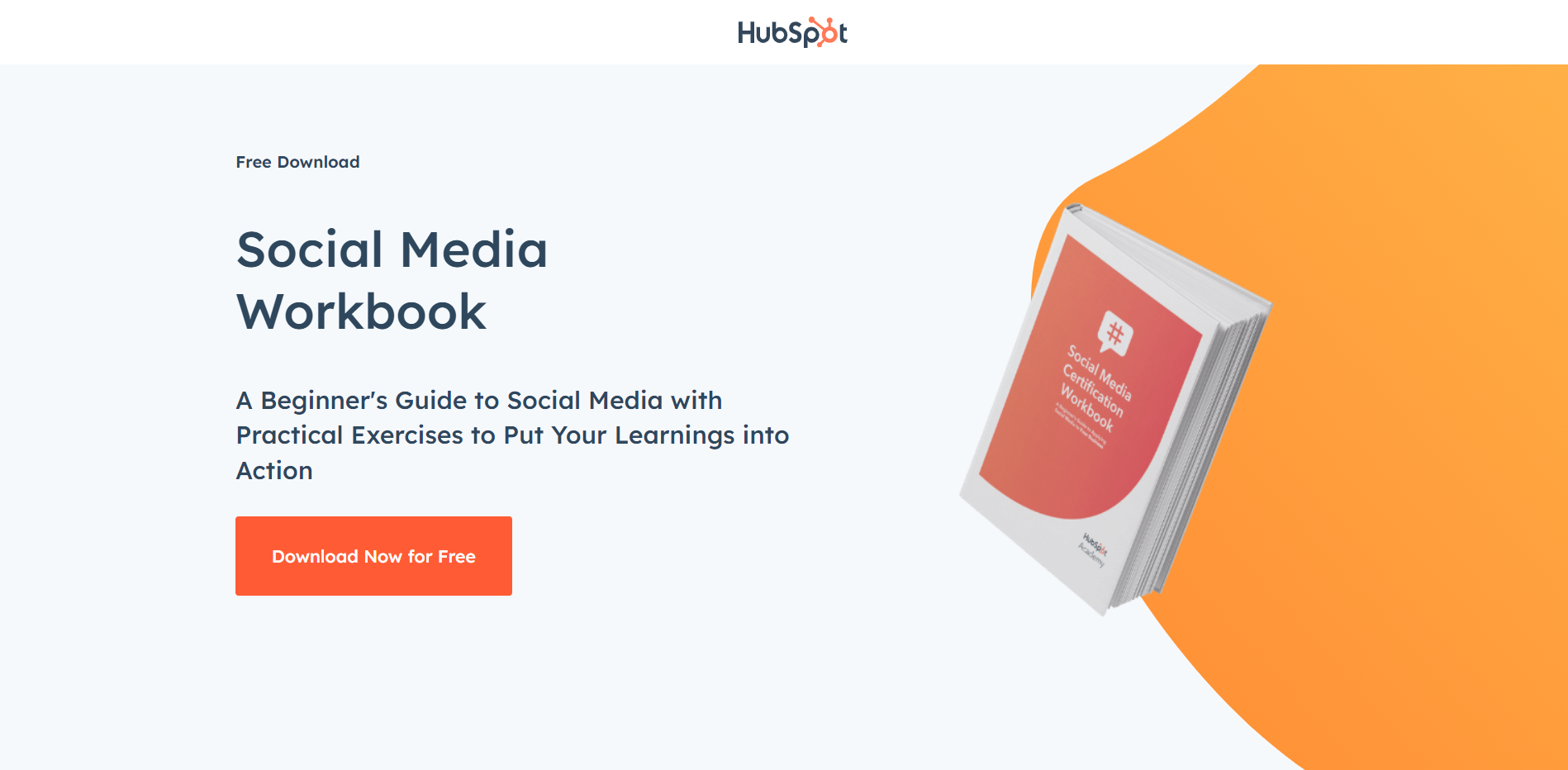
HubSpot uses white space, visual elements, and the number of elements very strategically on its Top-of-the-Funnel landing pages. Below the fold, there is much more information, if someone wants or needs to read more before downloading the offer.
Use white space strategically. The use of white space is important because it allows viewers some breathing room between sections of text without making them feel overwhelmed by too much information being presented at once. This makes it easier for readers who may have difficulty focusing on long blocks of copy due to the lack of contrast between words/sentences within those blocks themselves. White space helps break up these chunks into more manageable pieces. It can also be used strategically around CTAs to draw attention toward them. Our eyes naturally gravitate towards areas where there's less going on (visually speaking) compared with their surroundings. This increases the chances that someone will click through if they're interested in learning more about whatever offer is being made available via said CTA(s).
Inspire action. Call-to-action (CTA) buttons are an integral part of any successful digital marketing campaign because they provide direction and motivation for potential customers who might otherwise just leave without taking any further action after viewing your website's content. Think “Buy Now” button. Make sure each CTA you include speaks directly toward what you want people to do after reading/viewing something specific on your site, such as sign up now or download today.
Also, consider placing multiple CTAs throughout various points along a visitor's journey. This way, no matter where someone lands within your site, there is always an opportunity for them to take advantage of whatever offer has been made available. Otherwise, they might leave your site without ever having done anything else besides browsing around aimlessly, eventually getting bored, and moving onto something else entirely — which would result in lost revenue opportunities had nothing been offered during their visit at all.
By optimizing your landing page design, you can create an engaging and attractive experience for visitors. Now let's look at how to craft compelling copywriting that will help convert those visitors into customers.
Create Compelling Copywriting
Creating compelling copywriting is key to a successful landing page, as it can help capture the attention of potential customers and encourage them to take action.
Benefits over features. To create compelling copy, focus on benefits rather than features. Benefits should be highlighted in the headline and throughout the body of the text. Instead of listing out all the features of a product or service, explain how it can help customers solve their problems or improve their lives. Writing short and concise sentences helps keep readers engaged while also making sure they understand what you’re trying to communicate.
Be clear about what you are asking your readers to do. Include a clear call-to-action (CTA) that encourages readers to take a specific action such as signing up for an email list, downloading an eBook, or purchasing a product/service. Power words evoke emotion and using them can increase engagement with your content by helping readers connect on an emotional level, but be careful not to go overboard with them.
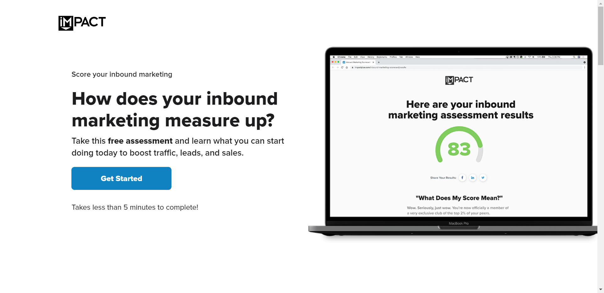
ImpactPlus uses clear copywriting and power words on its beautiful landing page, offering readers the opportunity to take a 5-minute assessment to gauge where their inbound marketing is.
Social Proof. Leveraging social proof such as customer reviews and testimonials adds credibility to your message by showing potential customers that others have succeeded in using your products/services before them. This type of evidence can be used in headlines or sprinkled throughout the body copy to engage readers further and encourage them to take action.
Make Mobile Responsive Design a Priority (Obviously)
With the rise of mobile usage, it is essential to prioritize mobile users when designing your landing page. Prioritizing mobile users means that you should keep content above the fold and utilize large buttons for easy navigation. This will ensure visitors can easily access what they need without having to scroll or zoom in on their devices. Additionally, consider using Accelerated Mobile Pages (AMP), which are designed specifically for mobile devices and load faster than traditional web pages.
Prioritize mobile users. It’s important to remember that more people are accessing websites from their phones than ever before, so it’s essential to ensure your website is optimized for these users first and foremost. Make sure all website elements look great on any size screen by utilizing responsive design techniques such as media queries and flexible grids.
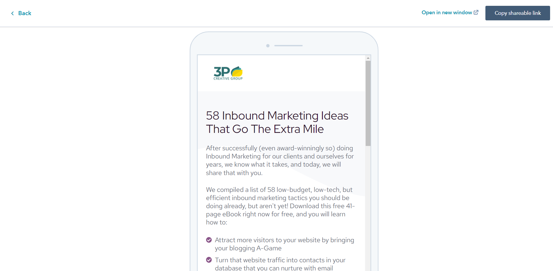
Test the mobile optimization of your landing pages in HubSpot.
Keep content above the fold. The “fold” refers to the area of a webpage visible without scrolling down; this is where most people expect information about a product or service to be located immediately upon arriving at a site. Keeping content above the fold ensures that visitors don't have to search around for relevant information — they can find it quickly and easily right away.
Utilize large buttons for easy navigation. When designing with mobile in mind, use larger buttons so visitors can easily click them on smaller screens like smartphones or tablets. Also, consider adding hover effects, so visitors know exactly where they're clicking when navigating your site's pages or sections. This helps create an intuitive user experience overall.
Consider using Accelerated Mobile Pages (AMP). AMP pages are designed to load quickly on mobile devices while providing an engaging experience with dynamic content such as videos, animations, etc. Implementing AMP into your landing page design could help reduce bounce rates due to slow loading times, while also improving SEO rankings since Google prefers sites built with AMP technology over those without it.
💡Key Takeaway: To create a high-converting landing page in 2023, prioritize mobile users with responsive design, keep content above the fold, utilize large buttons for easy navigation, and consider using Accelerated Mobile Pages (AMP).
Leverage A/B Testing to Improve Performance
A/B testing is a powerful tool to help you optimize your landing page performance. It involves comparing two versions of the same page and measuring which one performs better in terms of conversions or other desired outcomes. By running A/B tests, you can identify areas that need improvement and make adjustments accordingly.
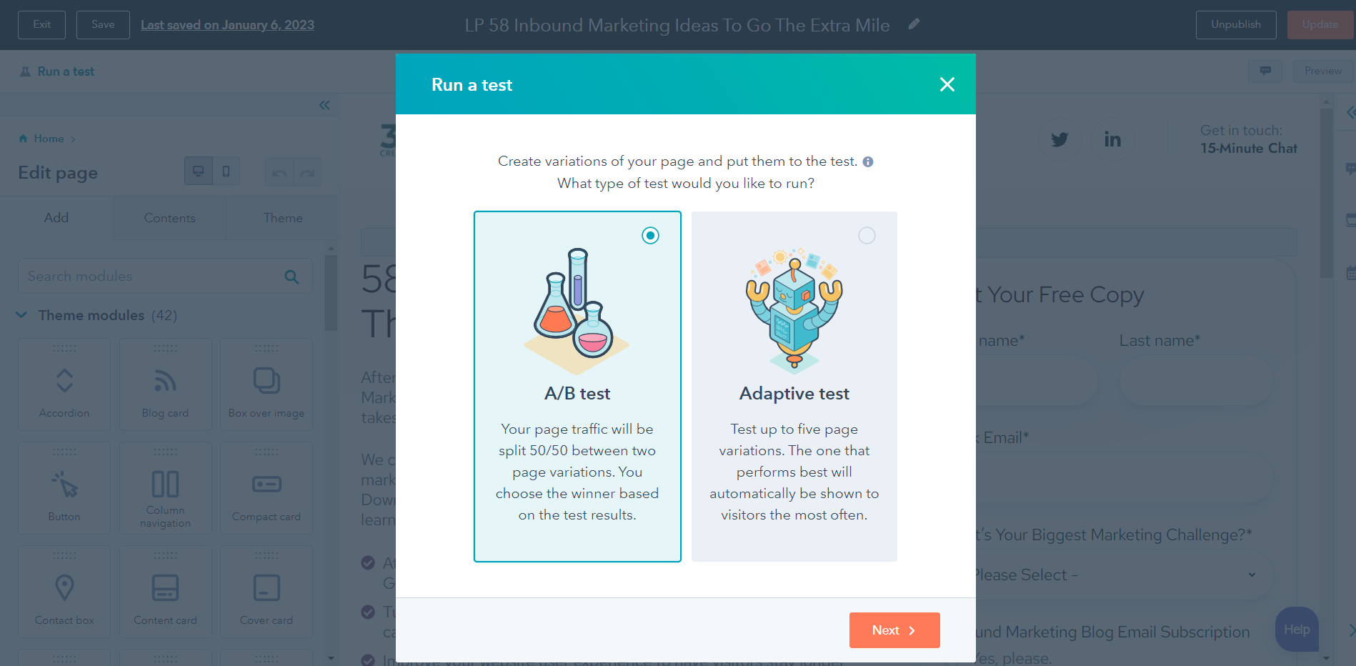
You can easily and quickly test your landing pages with HubSpot Marketing Hub.
Identify areas of improvement. Before starting an A/B test, it’s important to first identify potential areas for improvement on your landing page. This could include copywriting, visuals, layout, navigation options, or CTA buttons. Once you have identified these areas, you can set up an A/B test to measure their effectiveness against each other.
Set up A/B tests. Setting up an A/B test requires creating two versions of the same web page with different variations in design or content elements. For example, if you want to compare how different headlines affect conversion rates on your landing page, create two pages with different headlines and track how they perform against each other over time.
Analyze results and adjust accordingly. After running an A/B test for some time (typically at least 2 weeks), analyze the results to determine which version performed better than the other in terms of conversions or any desired outcome metrics that were tracked during the experiment phase. Make necessary changes based on this data so that future visitors are presented with the best possible version of your landing page when they arrive at it from search engines, social media platforms, etc.
Monitor performance over time. To ensure ongoing success with your optimization efforts through A/B testing, monitor performance over time by setting up regular experiments and tracking key metrics such as click-through rate (CTR), bounce rate, average session duration, etc. With consistent monitoring and analysis, you can keep improving user experience while maximizing conversion rates from organic traffic sources.
Utilize lead capture forms. Finally, don't forget lead capture strategies when optimizing your website's performance. Implementing effective lead capture forms allows businesses to collect valuable customer information while also increasing engagement levels across all channels. Utilize various tactics such as email opt-ins and exit intent popups to increase leads generated from organic traffic sources.
💡Key Takeaway: A/B testing is a great way to optimize your landing page performance in 2023. Identify areas for improvement, set up A/B tests, analyze results and adjust accordingly, and monitor performance over time to ensure success. Additionally, implement lead capture strategies such as email opt-ins or exit intent popups to increase leads from organic traffic sources.
Conclusion
In conclusion, the best practices for high-converting landing pages in 2023 include optimizing your page design, creating compelling copywriting, making mobile responsive design a priority, and leveraging A/B testing to improve performance. By following these tips and using statistics to back up their effectiveness, you can ensure that your B2B technology marketing efforts are successful. With the right strategy in place, you can create an effective landing page that will drive conversions and help grow your business.
Are you looking to maximize the effectiveness of your landing page in 2023? With 3P Creative Group's marketing and sales coaching, we can help you create high-converting pages to boost engagement with potential customers.
Share this
You May Also Like
These Related Stories

Smart CTAs: Why & How To Create Them In HubSpot

10 Best Practices To Create A High-Converting Landing Page

.png?width=250&height=125&name=TrustBuilderLogoWhiteTranspBackgr(250x125%20px).png)



No Comments Yet
Let us know what you think