

Let's say you are the marketer for a pool company and you meet someone while getting your morning coffee. You chat and you tell him you work for a pool company. His eyes light up and he says "My wife and I just bought a house and we are looking to buy a pool. Which one is the best?"
How will you answer? Well since you have about 5 seconds, I bet you will try to address his problem, be straight to the point, leave out unnecessary clutter and address his problem in a personal manner. This is exactly what your landing pages should be: a short one-on-one conversation solving your prospect's problem by showing them the benefits of your product.
To help you achieve that, I put together the 10 most important, must do best practices for your landing pages:
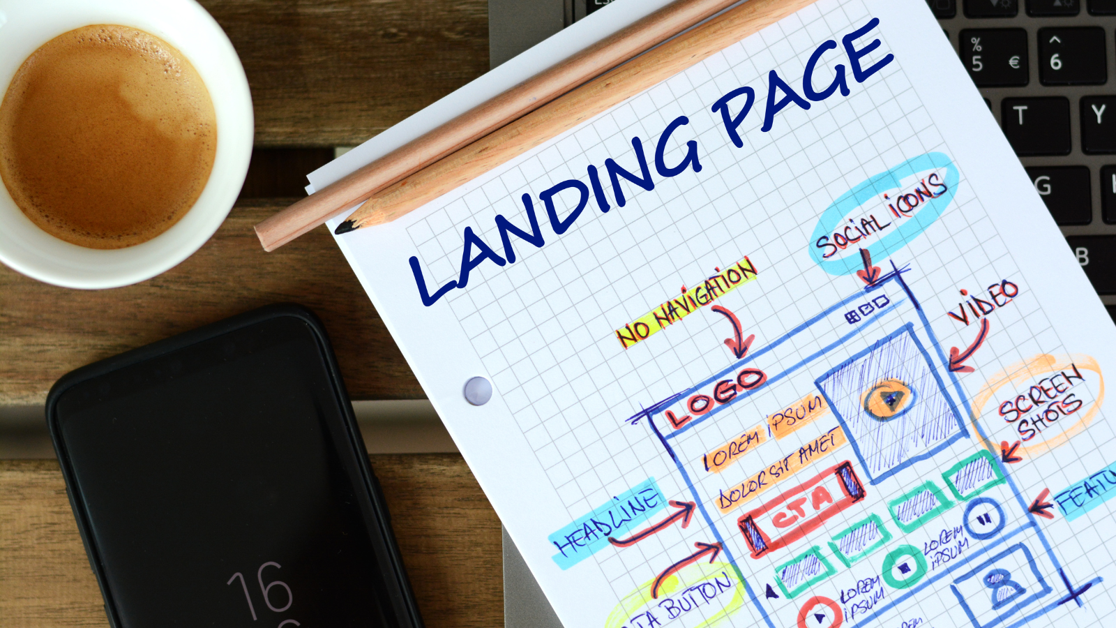
#1: It Must Be Clutter-Free
Eye-tracking studies have shown that visitors get confused by a cluttered design. They scan the page with no recognizable pattern. You do not want to confuse your prospects.
Create a landing page that has enough white space for the eye to clearly find its path to the call to action, the headline, and an image.
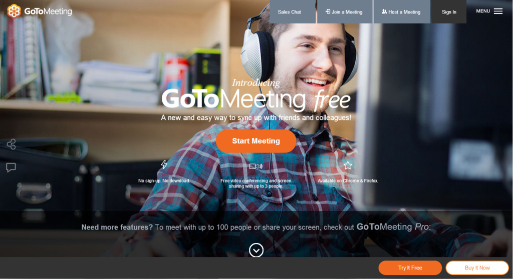
As you can see from GoToMeeting, they focus the attention on the Start Meeting button in the middle. However, the eye jumps from there to the face of the man smiling (because humans are always attracted to other humans smiling), and then we are left hanging - looking around at all the other 10 buttons! This is very confusing.
#2: Limit The Exit Points
You have done most of the hard work. You have written an amazing blog post that attracted interested searchers. You strategically placed an appealing call to action below it for people to click on. Now your goal is to convert them into leads (or if it is a product landing page into customers).
Make sure to set up your landing pages without a navigation bar, outbound links and other secondary call to actions that could potentially distract your visitor. You wouldn't want to decorate your store all nice, get customers inside just to offer them 3 doors to leave again, right?
#3 Crisp Headline
Your call to action drew them in, now your headline needs to deliver.
But crafting a great landing page headline is probably the most difficult step in the entire process.
Experts recommend to spend at least half the time creating the copy and half the time crafting the headlines. Make it short (about 6 words or less than 50 characters is optimal), clear and let it provoke an emotional response in your reader (urgency, fear, etc.).
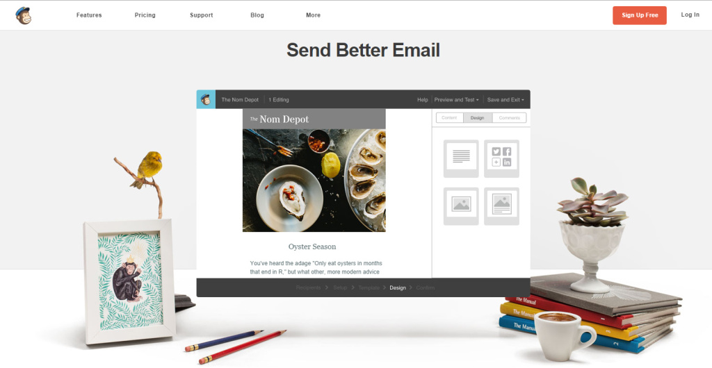
I love the simplicity of Mailchimp's headline Send Better Email. The image below is an animated GIF that shows how easy it is to build beautiful emails.
Pro Tip: Write out your headline on a blank sheet of paper without surrounding context. Does it still make sense? Can it be mistaken or misinterpreted? Copyblogger's "How to Nail Your Opening" would benefit from that test. :)
#4: Clear Quality Copy
Effective copy writing for landing pages is an art!
You have to identify with your buyer persona's problem or challenge, address it convincingly by offering your solution and listing its great benefits in a very precise, short and sweet way.
#5 Support Your Point With A Relevant Image
Did you ever hear the saying "A picture is worth a thousand words"?
Images can evoke an emotional response and translate complex subjects in a fraction of the time compared to text. Images are essential to any landing page design as images get processed 60,000 times faster by our brain than text.
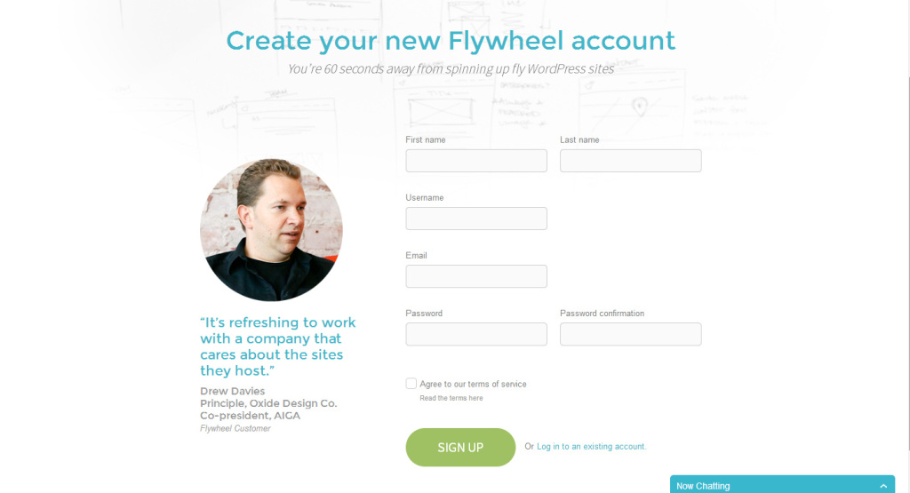
Pro Tip: Forget about stock images. Pictures of real human faces work best. Flywheel, a startup offering managed WordPress hosting, uses a customer testimonial and a real customer as their landing page copy! The man is looking towards the form, prompting the eye of the visitor to follow his gaze to the form.
#6 Compelling Call To Action
Your call to action on your landing page should prompt the visitor to do the one action your entire landing page is centered around.
"Learn More", "Sign Up" and "Download" are great examples of CTA copy because they are short and to the point - but they are generic and boring. Where appropriate, ask the visitor to do an action using the first person, for example "Start My Free Trial", "Apply for My Assessment", "Get My Copy Now" or "Schedule My Demo".
Pro Tip: A/B Testing call to action buttons can increase your conversion rate significantly. Create different buttons using slightly different text or color and see which performs best.
#7 Targeted To One Buyer Persona
Each landing page should speak to one type of customer only.
If you are offering medical solutions for hospitals as well as for long-term nursing facilities, create different landing pages. When a hospital administrator comes to your landing page for a case study how your product saved a New Jersey hospital $1.2 billion in costs last year, he should feel as if this page is written just for him.
Pro Tip: Speak to exactly the pain point that your buyer persona has.
#8 Solve A Problem
What is the exact problem that the hospital administrator is trying to solve? What could be the trigger for him to start looking for a solution now? Address the problem straight on and solve it in a clear, logical way. How does your solution actually solve the problem? What are the steps involved?
Harvest for example managed to identify the pain point of their audience in a very simple statement: Spend less time tracking and more time doing. Its genius.
Pro Tip: Have you solved the same problem for other clients? Include testimonials.
#9 Ask Little In Return
People are busy and they hate filling out forms! Make sure to keep your form as short and precise as possible but ask all the required information.
You can tailor the amount of information to ask for according to what stage of the buyer cycle they are in. Ask very little in the top of the funnel, and more in the bottom of the funnel: If you offering a downloadable how to guide or whitepaper, ask the first name, last name and email address. If you are offering anything that involves work on your end and you would like to pre-qualify your leads, ask for more detailed information.
Pro Tip: By using marketing automation software, you can also track additional information such as lead stage and pre-fill the form if your lead is already registered.
#10 Have An Awesome Offer
This is a no-brainer, but nevertheless true: Selling an awesome solution that speaks for itself is so much easier than trying to pitch your shady product. The same is true for a premium content offer.
What is your landing page optimization secret?
We would love to continue the conversation below. Tell us what worked for you or what didn't...
Share this
16 Best Practices To Create High-Converting Landing Pages in 2023
The 5 Laws Of Great SaaS Product Landing Pages

No Comments Yet
Let us know what you think