.png?width=250&height=125&name=TrustBuilderLogoWhiteTranspBackgr(250x125%20px).png "TrustBuilderLogoWhiteTranspBackgr(250x125 px)")

If you have a physical product to sell, creating a detailed product page for your website is easy. You include some professionally taken photos that show every line of texture and detail of your product. You lay out the primary benefits, and rattle through the features and specifications. It's easy. It should be just as easy for a virtual product as well, right?
Well, more often than not, it isn't. Let me tell you a little story. I recently had a conversation with a new client who asked for my help because his newly launched website was not at all performing as the company had hoped. The Visitor to Marketing Qualified Lead (MQL) was 0.04%! Even if the monthly website traffic would grow to 100,000 visits, it would take years to reach their goal. However, by summer, the company must generate thousands of MQLs. It's do or die!
#1: A Great Product Landing Page Is Essential To Your Success To Sell SaaS
Before our initial call, I went through the website to understand what the company does. It was nicely laid out and at first glance was nice. I thought I got a sense of the general direction of what the company does but after our conversation, I found that the company's product is so much more! They even had prospects sign up for a trial and then refuse a demo by the sales associate saying they don't know what the company even does. In essence, the website had two MAJOR flaws:
- No product/feature page. The product is awesome, and many clients would tremendously benefit from it. But, without a personal demo, I would have had no clue. Like so many SaaS companies, the organization had opted for a modern parallax homepage design, with no detailed product page!
- Confusing conversion paths. Scrolling around the website, I found several CTAs, however, they all clicked through to the same page! I clicked on the "Schedule a demo" button and was confused. The page was talking about learning more and product features. I hit the Backwards button to see if I clicked on the Demo button. I had. This page was serving several purposes: as a landing page to schedule a demo, feature the video, and talk about some of the product's features.
We are currently tackling this issue by building an adequately detailed product page that will help the company explain what they do and convert visitors into leads. The page will have call to actions to schedule a demo and sign up for a trial.
So, why is it then that so many Software-as-a-Service (SaaS) and technology companies find it impossible to create proper feature pages that explain what their product does? The answer is simple: It is very hard to accomplish. Besides the "Why Choose Us?", the product/feature page is one of the hardest pages to create.
#2: Turn Complexity Into Simplicity
The number one reason it is hard to write about our products is that we know them inside out. We live and breathe what we do every single day. It is hard to take a step back and assume the visitor doesn't know anything about who you are and what you do and explain it in a way that is simple — but yet captures all of its greatness!
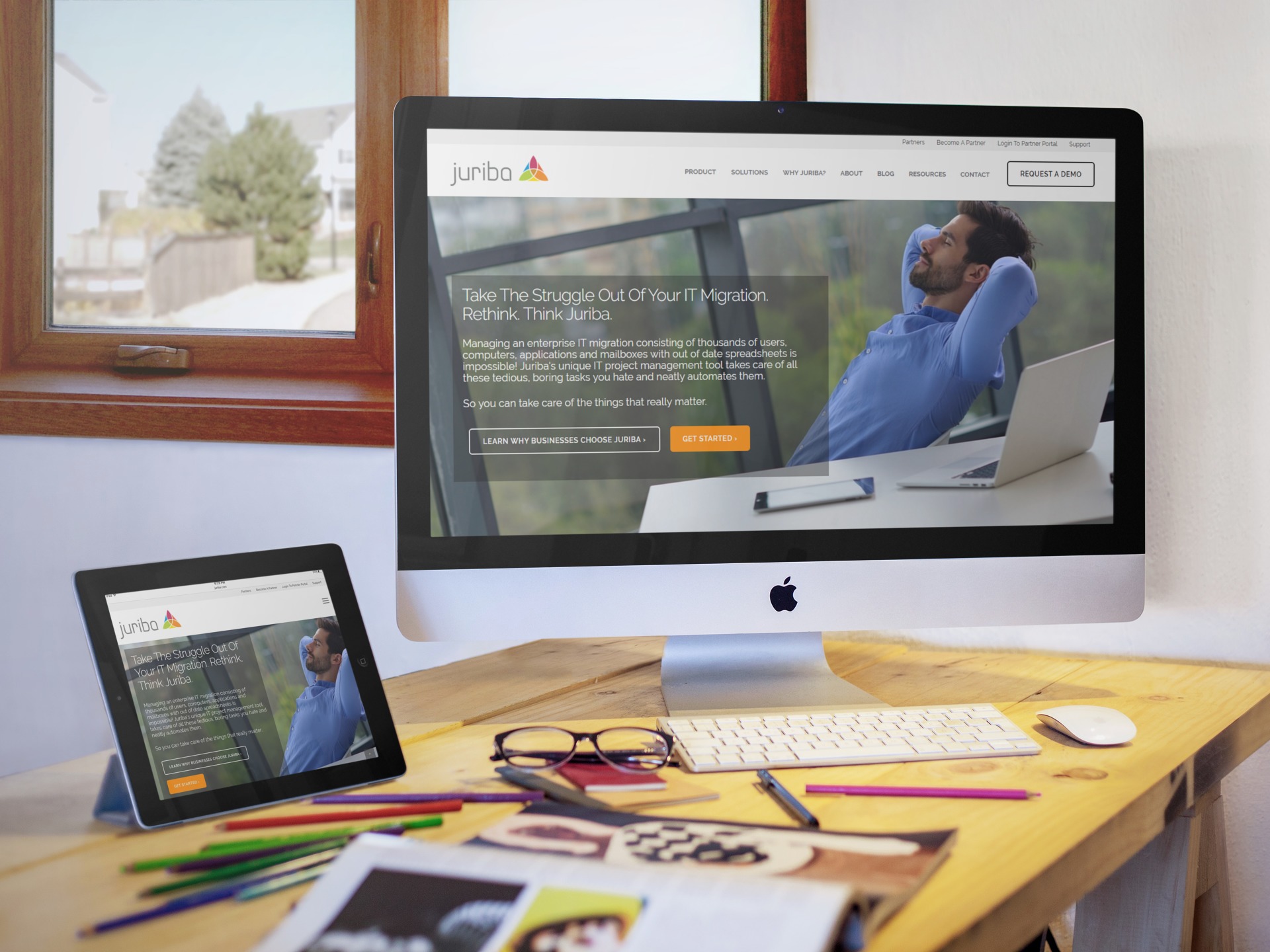
One of our clients, Juriba, has a problem many SaaS companies face: There is nothing out there that compares to their product. Their product, Dashworks, helps enterprises and other large organizations upgrade tens of thousands of users to Windows 10, Office 365 or other IT transformation challenges. Before Dashworks was created, IT project managers had to hand around dozens of outdated spreadsheets that needed to be manually updated, which always results in chaos and lengthy upgrade cycles.

We created this product overview page above and subsequent product detail pages to explain in an easy to understand 3-step framework what the product does. Because the term "IT Migration Project Management Tool" means nothing to people.
The page includes four crucial elements:
- A clear value proposition. The hero image section contains a clear value proposition statement which tells the visitor why they should care. It answers THE most important question that the rest of the page needs to tie back to: "What is in it for me?"
- Explainer Video. The second section features a more detailed explanation in form of written text as well as a product explainer video. Now your visitor can put your product in a bigger context.
- Benefits/Features. The next section is relevant to every product page. Depending on your product, you will need to adjust how you structure this to best present the benefits and features. Since this product makes processes significantly more efficient, we developed a framework to show the stages of the project.
- Call To Action. The pages end with a clear call to action — in this case, it is a product demo offer. It could also be a custom price quote, a consultation, or a trial. Make this appropriate to your buyer personas.
#3: Make The Page Visually Engaging
If you have a lot of features, as Wistia does, you need to break up your page into logical sections and plan out on paper first how you will present them. In this case, Wistia leads with their value proposition and key benefits. Knowing that hosting my videos on their video hosting platform will improve my chances of my website ranking on search engines versus on a third-party tool like YouTube is immediately breaking down some objections I might have had.
As a visitor, now I am interested. To keep visitors engaged on this crazy long feature page (it contains more than 20 unique benefits/features), the company keeps the page attractive with lots of white space, neat graphics and — this is the important part — different looking segments. Some benefits are grouped into 4 columns across; some key features even are presented by themselves with animated GIFs. This keeps the page interesting and visitors engaged as they skim through the page.

The only suggestion for improvement I would have on this page would be to add a call to action at the end of the page. After reading through all the great features, I am left hanging as to what I should do next. I would add a prominent CTA to sign up for a trial or even the form right then and there to lay out the next steps.
#4: Break Long Feature Pages Into Digestible Bites
If you have ever checked out the HubSpot marketing platform, you know there are so many tools and features, it would be impossible to present them in a reasonable manner on one page! However, a product tour like the one below is not only solving the presentation problem, but lets your visitor discover the product by themselves step-by-step in an engaging and progressive manner.

When you click on "Start the Tour", you come to a page which begins describing the SEO tool - which is a logical beginning as the inbound marketing methodology starts with getting content in front of visitors first and search engine optimization is essential for that. As you click through the product features (grey boxes), the screenshot changes to illustrate the point.

The product tour ends with an offer to schedule a personal demo.
#5: Usability Comes First — Always
We have established by now that product pages are so difficult because they have to convey a ton of information to different people who come with all kinds of expectations, preconceived notions and previous experiences with your company. The sheer complexity of it makes it hard to present the information in an easy to consume fashion. Therefore, it is not surprising that the more complex a page is, the harder it is to make it user-friendly.
Take this beautiful product landing page from Mind Body for example. Visitors can get to it by navigating to "Features" under the "Product" tab. However, you will go immediately to the first feature: Online Booking. The page is clearly laid out and finishes with a prominent call to action to schedule a demo.
The big problem I have with this page is the following: There are seven main features: Online Booking, Marketing, Point of Sales, Automation, Client Tools, Staff Resources and Reports. You can read more about all the features by clicking on the icons below the hero image which brings you to a new page describing that feature, for example, the marketing benefits (screenshot).

Essentially, there are three mental leaps a user needs to make:
- By clicking on features, I would expect an overview page, but it goes right to the first benefit.
- I am reading about online booking in the hero image and click on marketing tools. The hero image changes. I have not seen the rest of the page yet. Let's say I read on and scroll down.
- Now I would have to scroll up again to click the icon to get to the next feature.
Retention Starts With Knowing What You Buy
To wrap this up, I want to stress how crucial a top-performing product landing page is for Software-as-a-Service businesses. You sell a virtual product that your clients cannot touch, smell or taste.
The worst thing that can happen to any software company is if the users do not know what the software actually does and how to use it to its full potential. Because then it becomes shelfware. Or for Saas, customers become unhappy and cancel their subscriptions. But customer retention is key! And it all starts with an information product page that explains exactly what the product does and how it is down.
Share this
How Growth-Driven Design Turned A Software Company's Website Into Enterprise-Ready
Must-Have Elements Your Home, About Us, & Resource Website Pages Need
No Comments Yet
Let us know what you think