5 Impactful Ways To Convert Your SaaS Trial Sign-Ups Into Customers
At the beginning of the year, we switched payroll systems.
We wanted to use a cloud-based Software-as-a-Service solution that would enable us to quickly pay contractors and employees, while painlessly managing all of our small business HR needs, such as vacation and overtime.
We did a lot of research, we talked to a bunch of sales reps and started a few trials.
Moreover, while the solutions were almost identical — how many times can you reinvent the same HR wheel, right? — the sales approaches could not have been more different.
Some sales reps were rude and provided no additional information beyond what we had already found on the website, while others were extremely helpful throughout the entire process. They sent us helpful follow-up emails, made sure the trial was set up correctly, and that we knew our way around the product. Needless to say, we went with the helpful company.
75-90% Trial Users Go Cold Within 1 Hour
While not all SaaS trials are created equal, all trial evaluations follow the same journey through the conversion funnel.
A prospect is looking for a solution to a particular problem or opportunity, and as he or she evaluates different options, they might find your landing page and sign up for a free trial to better assess your product. Once signed up, they would ideally take the necessary steps to set up the app and start using it.
On the marketing side, you generate qualified traffic and attract interested visitors to your landing page through targeted inbound marketing and lead generation efforts. To get more signups, you optimize your landing page using A/B Testing, copywriting and other tactics. In the active trial phase, you should increase your user's engagement with the product by a) removing all friction to create a smooth onboarding process and b) help them stay on track with targeted and helpful communication.
The active trial phase is a very crucial point to converting these users into paid customers.
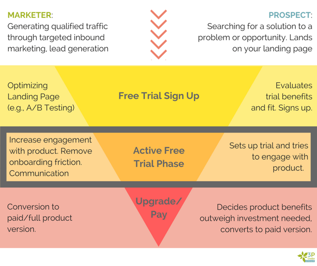
While it is important to get enough qualified traffic to the landing page and encourage a large number of trial signups, it is critical to understand that — according to Totango — even in the best-of-breed SaaS companies about 75% of the trial subscriptions will not convert into paying customers. 70% completely drop off after filling out the form and do not engage with the solution at all and only about 20% of those who signup are logging in daily and use it.
This 70% is a huge opportunity! A lot of Software-as-a-Service companies underestimate what it takes to get this trial signup converted into an engaged and happy customer. Most focus on getting as many signups as possible, but they neglect to put in the effort into the trial experience itself.
According to CrazyEgg, users who actively use your app for 3 days, are four times more likely to convert.
Use this opportunity to convert active users to paying customers early. To inspire you to provide your user with a better, more engaging and ultimately more beneficial trial experience, I put together five creative examples that you could implement now:
Make Them Feel Warm & Fuzzy
Congratulating someone on signing up for a trial of your product can be a bit tricky, as you can quickly cross that line into Cheesyland, and you do not want to go there. After your users have signed up for your free trial, you should make them feel welcome. They are part of something bigger now: the [insert your company name here] family.
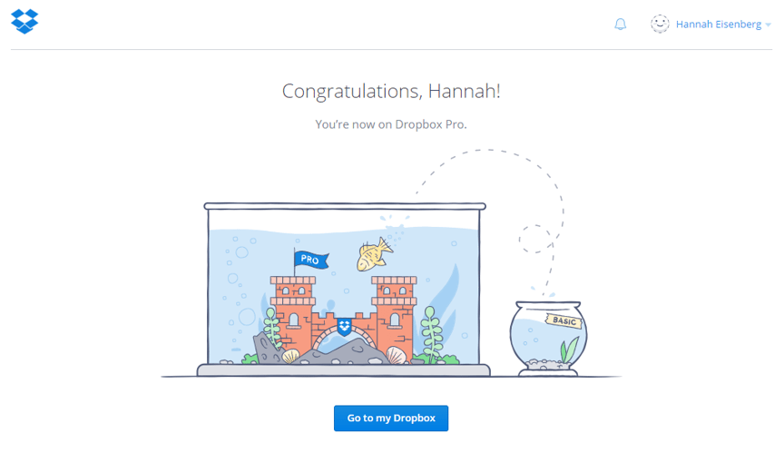
DropBox does this very simply with a few lines of text, including using a personalization token of the first name, which creates a sense of familiarity between the trial user and the company. A prominent call to action button underneath the picture will get me started using the product.
Let Them Choose Their Destination
If you have different solutions or product options, it is important to be clear on which the trial will be on. Intercom has three distinct products that can be used separately (chat, marketing automation, and customer support) but can also be utilized together. As you choose an option, the screen will show you a feature/function overview of the Lite and Standard editions, including the cost that you can expect after the trial expires, so there are no sticker shock nightmares at the end.
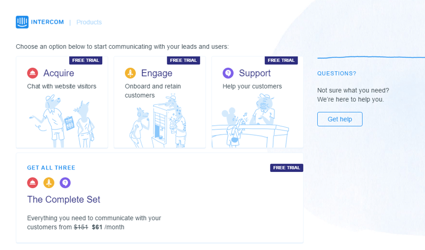
Another thing to note here is that most likely your trial user does not know which product is right for them yet. Many solutions can be complicated and lengthy to describe, and they do not want to invest the time in reading about the solution — but much rather try it out themselves. So, if you do have different choices, make sure to include a "Get Help" button so you can help them make the right choice for their needs.
Make Sure They Are Set Up Correctly
Most Software-as-a-Service solutions require some setup. This is especially true when you need to install a JavaScript tracking code on your website or enter any other crucial information necessary to use the app.
Pure Chat is no exception. When you sign up for the trial, you get a quick welcome message and detailed instructions on how to install the code snippet. Since most users are not familiar with installing tracking codes, Pure Chat has made a quick video going through the instructions. Below it, you can find different options (add the code yourself, send it to the web developer, or use the plugin) in a tabbed format that makes the page look cleaner and more scannable.
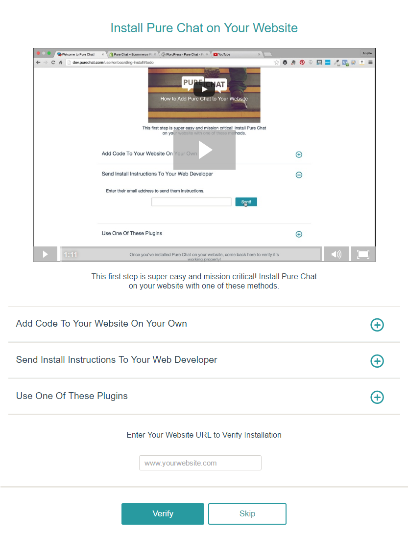
Example: Pure Chat
Streamline Your Setup Process With A Checklist
Once your website is verified, you will be redirected to your dashboard. Things get a little muddled from there regarding setting up, but if you lose track of what to do next, there is a handy little checklist that guides you through the rest.
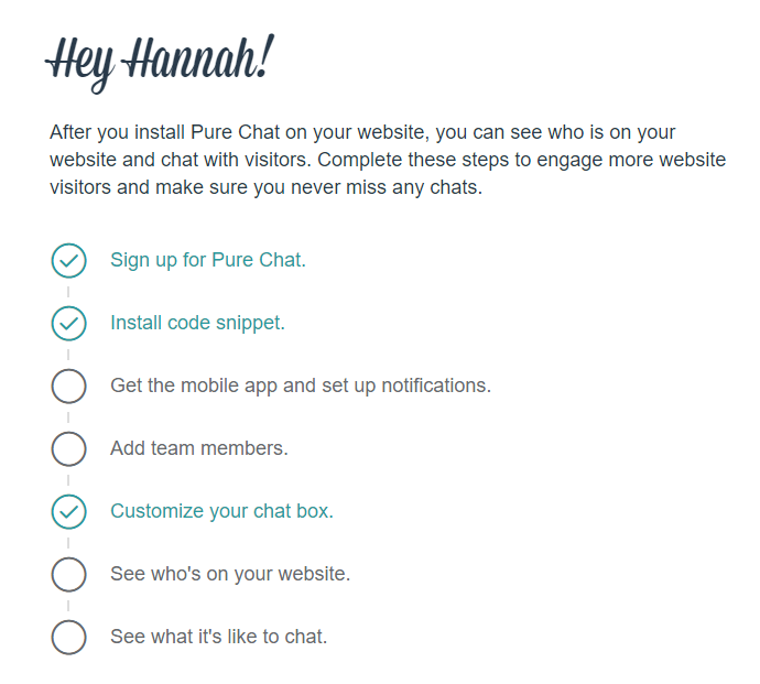
Example: Pure Chat
Give Them Incentives To Engage With Your Solution Right Away & For The Next Few Days
I have to admit, the language on this page sparked this blog post! I love the copy! Love it. It is to the point, clear and precise. It is personal and light-hearted, approachable and yet convincing.
Quip, a SaaS-based wiki solution that was just acquired by Salesforce to compete better with Microsoft Office 365, welcomes new trial users by giving away a free T-Shirt to all users who "give it a fair try." All you have to do is create a document in Quip, invite a team member and share the document with them. Once they edit it, Quip is sure you will understand the value proposition of their solution and they will send you a T-Shirt.
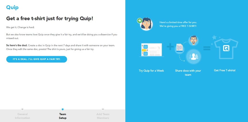
Example: Quip
It all sounds quite trivial, but this is a very smart approach.
First of all, you get new trial users to mentally commit to taking the product for a spin by making the click "It's a deal. I'll give it a fair try." You make them jump through just enough hoops, so they get it, but not too many that they could get overwhelmed.
Secondly, with the right tracking in place, you can now see who is engaging with the software and when they drop off. Maybe they need a follow-up call, chat or friendly email reminder to get them back on track? Put yourself in their shoes or ask people who do not work for you to sign up and go through the on-boarding to provide you with feedback.
I hope, you found the examples above helpful and inspiring to create an outstanding active trial period for your new users!
Share this
You May Also Like
These Related Stories

10 Best Practices To Create A High-Converting Landing Page

16 Best Practices To Create High-Converting Landing Pages in 2023

.png?width=250&height=125&name=TrustBuilderLogoWhiteTranspBackgr(250x125%20px).png)

No Comments Yet
Let us know what you think