.png?width=250&height=125&name=TrustBuilderLogoWhiteTranspBackgr(250x125%20px).png "TrustBuilderLogoWhiteTranspBackgr(250x125 px)")

I remember exactly how I sold our first Growth Driven Design retainer.
I was on the phone talking to the Chief Technology Officer of Juriba, a UK software company whose enterprise IT project management tool enables large organizations worldwide to manage their IT transformation projects — imagine migrating tens of thousands of end users to Windows 10 or a new email system or similar.
Traditionally, this lengthy, costly and often risky process had been "managed" with nothing more than Excel spreadsheets or hand-cranked databases. We were chatting about potentially redesigning the company's website and supporting their inbound marketing efforts.
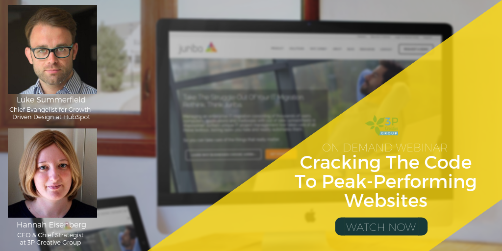
Just a few months before that, I had started to look into ways how to improve our web design and development process to include user feedback. That's when I discovered HubSpot's Growth-Driven Design initiative, promoted and evangelized by no other than HubSpot's own Luke Summerfield! I was hooked. In fact, I just got early access to the upcoming GDD certification program.
As soon as I said I would love to develop his website using the Growth-Driven Design approach, he immediately got it. I explained that this was a new process, and he was happy to be the guinea pig. I was so happy that he was as fired up about it as I was.
And today, I want to share Juriba's incredible growth story from the website redesign perspective.

The Challenge: The Existing Website Did Not Say Enterprise Software
There were too many issues with their old website to go into in just one blog post, but to illustrate how we used GDD to improve the website, let me show you how we improved the homepage.
The biggest problem of the existing website was that that is was not equipped to attract international enterprise customers or partners. It looked outdated, disproportionate, and did not reflect the amazing software company Juriba really is.

Another more pressing problem was that most of the information was tucked away in places casual visitors could not intuitively find it.
The blog the company has been writing since early 2009 was almost impossible to find, as were the fantastic resources the company was offering! Visitors had to scroll down to the bottom of the page to the footer menu to find the product or company information they were looking for.
In order to find out how visitors were using the website, we used heatmaps to visualize user behavior on the site. The heatmap below shows a quick snapshot of 475 visits and where the users clicked on the homepage. This particular view shows the clicks, but you can also visualize the scrolling and movement on a particular page. This enables us to pinpoint exactly where the problems are and gives hints to how we can fix them.

The footer was the biggest jump-off point for visitors to reach deeper pages within the website:
 17.1% of visitors clicked on the product menu in the footer versus only about half of the people looking for product information clicked on the "Dashboard" tap in the top navigation 9.5% clicks.
- 14.3% clicked on the About Us menu in the footer, but only 10.7% clicked on the About tab in the top navigation
- 9.7% clicked on the contact information in the footer
- The resource page was slightly more often clicked on in the top navigation menu (4.4%) than in the footer menu (3.5%).
Other elements on the homepage were not very successful either. The hero image was static and not clickable — but visitors still tried to expecting to get somewhere. Below the image were the sections introducing the three main use cases for Dashworks: Windows 7/8/10, Office 365 and Email Migration. However, the Windows 7/8/10 button as the most popular one received less than 6% clicks.
The inner pages of the website also had a variety of issues. All pages had to be rewritten since they featured relatively thin, and very out-of-date content. There were no call-to-actions or further paths offered, so visitors were left to figure out that to schedule a demo they should click the "Try" tab in the main navigation. In the heatmap snapshot of the homepage, only one person managed to view the demo landing page.
Goals For The Website Redesign
There are many ways you can measure the success of a website redesign — even though most companies do not actually track any specific key performance indicators (KPI's) that would indicate how successful the redesign was. They like it, or they don't.
We wanted to be more specific because you can only manage what you measure. We are tracking on a continuous basis the following metrics:
- Average Pages Per Visit / Average Time On The Site
- Overall Conversion Rate (Website Pages, Blog Posts, Landing Pages)
- Click Through Rate on special pages of interest
- Lead Quality (# of Marketing/Sales Qualified Leads / # of all leads)
While all these are important goals, our focus was mainly to increase the quantity and quality of leads.
I am thrilled to say, we already far exceeded our expectations!
Results After Only Five Months
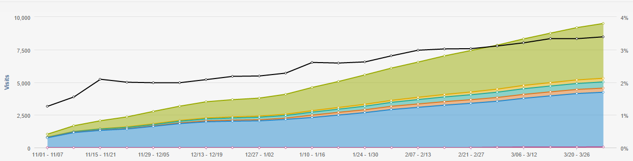
We launched the new website on November 1st, 2015 — it has been five months since the launch.
- 44% website traffic increase in the past five months, however, compared to the same period, the traffic has increased by 130% (website history shows the traffic to be very seasonal)
- 30% of the traffic increase was from organic search; blog traffic now contributes to 35% of total website traffic
- There was no paid search during either period
- 10% of the increased traffic was from social media and email promotion, which before was hard to measure in the old marketing automation software.
- Juriba has been running a very successful and active LinkedIn group for years, but since the launch of the new site, we have seen increases of 500-600% of LinkedIn referrals.
- 90% more leads in total and 8-9x more qualified leads
- 1200% increased sales pipeline compared to last year!!!
Surprisingly to us at first, pages per visit and time on the site decreased. However, this was due to our growth driven design process and studying the heatmaps. We combined several thin pages into one and made the content easier to navigate to.
The Growth-Driven Design Process
As we do with all accounts, we spent the first 30 days researching, learning, and building an inbound marketing and website strategy. In this initial period, we performed a detailed website and content audit, keyword research, buyer persona definition and an analysis of the results and campaigns of the current inbound marketing efforts in the existing marketing automation tool. We also analyzed the results of the heatmaps we captured and the existing Google Analytics data.

In the process, we decided to recommended to Barry switching to HubSpot to power the company's inbound marketing efforts as well as to host their new website. The main criteria for switching from WordPress to the HubSpot COS was the enterprise security, the built-in mobile responsiveness, the ability to seamlessly integrate the lead generation with the website as well as the smart content / contextual marketing.
Based on our extensive research and strategy, we compiled a wishlist in which we collected more than 180 must-have and nice-to-have items that we thought would be needed or useful in the website. These items ranged from having an easy to navigate resource page to present interested users with downloadable eBooks, guides, and project plans; to having featured blog posts on the top of the blog listing page and tabbed categories on the blog page to let visitors interested only in Windows 10 to view the most recent articles about it.
We reviewed this list with the client and decided which of these items should be included in the initial launch pad website (based on the 80/20 principle), which action items would be tackled over the next few months, and which would be moved to the parking lot for now.
Now, it was finally time to get started creating the website.
The Initial Launchpad Website Immediately Improved Lead Generation
Within a very short period of 60 days, we were able to not only relaunch Juriba's website in a beautiful new design but also to restructure it, rewrite all the content (expect of the existing blog) and to move all the lead generation content of their previous marketing automation tool. Some pages had to be created new from scratch because they were simply not there before.
Now the homepage gives a visitor who comes directly to the website or clicks through from a blog post an overview of what problem the company solves and how, gives plenty of options throughout the page to jump into the deeper pages of interest as well as introduce lead generation offers such as the Windows 10 Project Plan and the resource page.
Below is the heatmap of the initial launchpad website's homepage. As you can see, there are many clicks above the fold and throughout the entire homepage as people are finding the information they need much easier and faster than before.

The structure of the homepage is designed as follows:
- Value Proposition: Big hero image featuring the company's value proposition loud and clear: it makes IT migration simpler and more efficient. This is backed up by a short subheader and followed by two call to actions: to learn more about why other companies choose Juriba and a "Get Started", leading to a consultation offer.
- Problem Statement: Next, we acknowledge the buyer persona's problem. Because the solution is new and needs a lot of explaining, we wanted to state the problem IT project/asset managers face and tell them: "We have been there. And we have a better solution for you".
- Solution Overview: Before we dive into how the product works, we introduced the most common use cases. This way the visitor has this in the back of their minds how they can use the tool when we explain how it works.
- Product Details As A Process: Since the product needs a lot of explanation, we structured the product section in a logical 3-step process, going through each of them in more detail.
- Top Of The Funnel Offer: Next, we introduce one of the most popular top-of-the-funnel offers — a fully customizable project plan to manage an enterprise Windows 10 migration. The visitor also has the option to explore the resource page from here and view all the other helpful resources.
- Customer / Partner Section: One of the last sections is dedicated to showcase the incredible success record the company was able to build over the past ten years as well as its enterprise partnerships with Microsoft, Hewlett Packard Enterprises and more.
- Bottom-of-the-Funnel Offer: Before we close out with the footer, we included a bottom of the funnel offer to schedule a personalized demo. Any visitor who has been looking at the homepage and is engaged enough to make it to the bottom can fill out a request to schedule a demonstration of the product here.
After three months, we revised the menu slightly as we saw a lot of clicks on the blog and resources that were previously in the top, secondary menu. We pulled these into the main navigation.
The secondary menu now mainly holds the partner-related menu items (such as "Become a partner", "Partner Portal Login", and "Support"), while the main menu gets the most clicks — just as it should be.
Further Improvements Since Launch
Since we launched in November 2015, we made significant improvements to accommodate the recent success.
For example, the company became an HP Enterprise Services partner to accelerate enterprise Windows 10 services which is an incredible milestone! But now, hundreds of HPE consultants will have to get access to a professional partner portal that provides them with access to product training, marketing, and sales assistance, a library of resources and downloadable files. So we built out a thorough partner portal with 20-30 pages.
In addition, we sharpened the copy on all landing and thank you pages to be crystal clear that Juriba is a software company, not a service provider.
We improved the product pages and redesigned the blog page to increase the quality of the time spent on the site but also the overall engagement of the user with the site.
We tested the performance of different call to action formats and landing page designs.
Future GDD Plans
The beautiful thing about GDD is, it is never done.
We still have dozens of action items on our nice to have list and as we progress, we are adding more based on what we learn. We plan to keep improving the website by including a customer success page that includes case studies and client success stories — and Juriba does have success stories to share.
In addition, we plan to improve the solution pages, add job listings and a career page and much more. So stay tuned for more updates very soon.
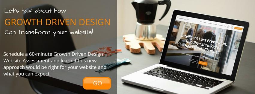
Could 3P Creative Group's Growth-Driven Design achieve similar results for your company? Click below to apply for a complementary 60-minute GDD consultation with one of our web strategists and find out!
Share this
How 3P Creative Helped Grow A B2B Software Company's Pipeline By 1,200%

16 Best Practices To Create High-Converting Landing Pages in 2023

No Comments Yet
Let us know what you think