Why "How Often Should I Redesign My Website?" Is The Wrong Question To Ask
When I was seven years old, we went to the Monza racing track.
A friend of my parents had some connections, and we got to watch the Formula 1 race cars do practice rounds. It was amazing. We marveled at the amount of noise the cars made as they roared by. When they finally had finished, we got to sit in one of the racing cars. It was a red Ferrari with huge tires and its body almost laying on the ground. Sitting in this car, even as a 7-year old, I could feel the enormous power pulsing through it.
Last week I was reminded of this precious childhood memory when I was talking with a potential client about a possible inbound marketing retainer.
Why You Should Redesign Your Website
We were talking about his ambitious long-term goals and how he needs his website to start generating more quality leads. To do that he was considering to buy a powerful marketing automation tool.
He understood that you need to create helpful content and place call-to-action buttons in strategic places so your interested visitors could find them easily and convert into leads. He also understood that you need to nurture them carefully because not everybody is ready to buy yet — and he wanted us to execute this plan.
However, then he said something that completely baffled me:
"I know my website needs a lot work. It's really old and outdated. But there are not many people coming to the website right now, so it is not worth investing anything into a website redesign."
For a moment, I did not know what to say. Why would you invest in a top-notch marketing automation tool and inbound marketing services when your website is a hopeless case? Your website is your vehicle; your race car if you will. You can put the best race car driver in the crappiest car; it still is a crappy car.
What good does it do if you have a powerful marketing automation tool in place, beautiful, well-designed landing pages and the most helpful offers in the world if no one comes to your website because it was built in 2009 on outdated technology and just does not work for what you are trying to do?
Common Reasons To Update Your Site
While this is an obvious argument for a redesign, when you are actually in the situation, and you are so used to your website, it can be difficult to take a step back and realize it is time for a change.
So, let's take a minute and look at the most common reasons why you should redesign your website:
The purpose of your website has changed.
In the example above, the purpose of the website changed from being a stand-alone billboard website to a lead generation website. Consequently, it should be laid out differently, include more user-driven navigation paths (e.g., segmented by buyer persona) and so on.
You are not getting the results you need.
If your website is underperforming, it is probably a sign that your visitors are expecting more or something different from your site. It is your job to find out what that is and update it. A thorough audit including conversion, content, site architecture, search engine optimization will help you figure out what's wrong.
Your website is dysfunctional.
Once in a while, you come across websites, and you wonder, how it is even holding together. There is just so much wrong with it; you leave frustrated. If this is the case with your website, it is time to face the truth: you needed a redesign a long time ago.
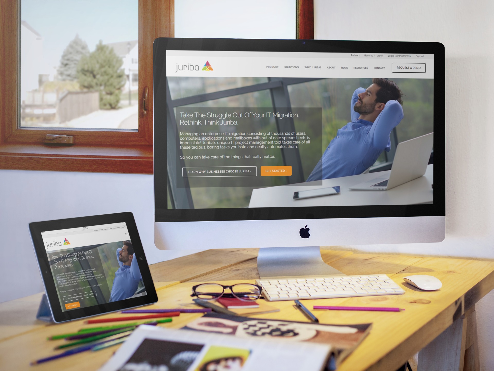
Your website is not mobile-responsive.
According to comScore, 60% of the website traffic is now coming from mobile devices. If your online presence is not built to display on the smaller screens of smartphones and tablets, you are not only frustrating your users but also lose brownie points regarding search engine rankings. If you are not sure, Google offers a free tool to test your site's mobile responsiveness.
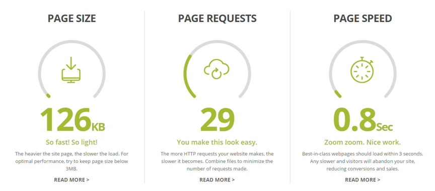
Your website loads too slow.
This seems trivial, but let me illustrate why this is important: If your eCommerce website makes $100,000 in sales every day, a 1-second delay in load time would could you $2.5 million in lost sales every year. Your visitors have no patience to wait longer than 2 seconds for your website to load, or they will leave.

You are starting with content marketing or inbound marketing.
So, if you are planning to embark on a major content marketing initiative or your are starting with inbound marketing, your website will need to accommodate these new responsibilities. Your website will become a lot more content heavy and with that come many changes.
Your competition has updated their website.
I am not a fan of doing what your competition does, but in this case, you will need to pull with the trend. If your website is frustrating to your users and your competition's is not, your competitor gets your business.
If you are not sure, where your website stands, run it through the Website Grader or let us give it a quick look over.
Sporadic Redesign vs. Constant Improvements
Now, the next question people usually ask is how often should they plan on redesigning their website.
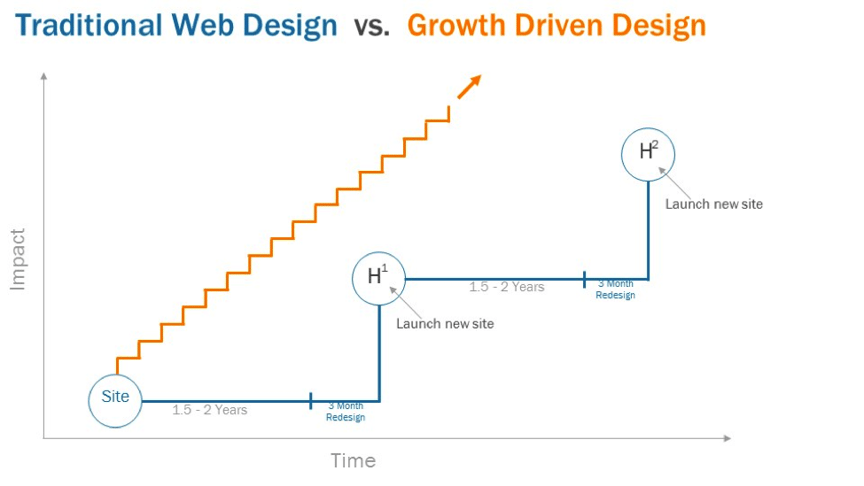
A few years, the answer would have been "every two to three years" while nowadays most website design firms will tell you that you should aim more towards an 18-24 months timeframe.
However, I argue, that asking how often you should revamp your online presence is the wrong question to ask. In my opinion, your website should never be done improving. We need to start thinking of websites as living and breathing things that need constant attention.
Tweet: Start thinking of websites as living and breathing things that need constant attention. http://ctt.ec/J5wk3+
And I am not alone in that — some of the best, and most innovative web design firms in the inbound marketing space are currently embracing a new approach to web design, called Growth-Driven Design.

It borrows from the lean manufacturing and agile software development methodologies. Using this method, websites are continually improved upon following a strategically laid out plan by running through small (monthly) cycles while continuously measuring, learning, adapting and tweaking.
There are many reasons why a continuous improvement is preferable over a sporadic redesign every couple of years:
Your Business Is Ever Evolving — So Should Your Website
Would you let a salesperson out on the floor talk to your customer if he or she is reciting completely outdated information? No, or course not. You would tell them they have to get up to speed fast, or they will have to find a new job. Because you cannot afford to give your clients wrong information that will leave them frustrated and not trusting you! So, why are we letting our websites do the same thing?
Your business is evolving. Your business model or pricing might change, and your products or services are regularly updated. Your website needs to reflect that!
Your New Website Is Only A Best Guess Of What Will Work
How do you know that your new website will perform at peak? The answer is simple: You do not.
Because you and your designers and developers are working in a bubble for three months or so and the outcome of this process is the best guess of what we think will work. However, since there is never any user involvement, you have no way of telling if the slider that your designer loves so much is, in reality, distracting your visitors. Alternatively, the copy of your call-to-actions is not clear to your prospects, leaving them confused.
The only way to change that is by continuously measuring, learning, adapting and tweaking.
Consistently Improving User Experience
You know the effect better customer service can have on your bottom line. The same goes for your website
- If you can help your prospects to find the content they are looking for or if you are providing them with helpful tools they are more likely to buy from you.
- If you eliminate distracting elements from a page and lay out a logical conversion path, your visitors are more likely to turn into leads and then customers.
- If you tweak your messaging to be more precise and targeted, your audience is more likely to listen,
and the list goes on.
Conclusion
In summary, websites are never a set and forget kind of thing. They should be treated as living and breathing things that need constant attention. As your business evolves, your website should change as well - always striving for a better user experience.
Share this
You May Also Like
These Related Stories

5 Quick Projects You Are Better Off Hiring An Inbound Marketing Company

How Growth-Driven Design Turned A Software Company's Website Into Enterprise-Ready

.png?width=250&height=125&name=TrustBuilderLogoWhiteTranspBackgr(250x125%20px).png)


No Comments Yet
Let us know what you think