4 Crucial Things Your Sustainable & Tiny House Website Is Missing
Recently, my husband and I bought six hectares of land in the beautiful Mugello Valley. Our plan was to put up a Tiny House and live there for the next two years until we can build the Passive House of our dreams. I am a Certified Permaculture Designer and passionate about sustainability, and living in a Tiny House on our own farm while continuing my marketing work has been a dream of mine for years.
In my very extensive research process (I have to convince a very tiny Tuscan municipality to let me do something they have never heard of before), I have looked at about 40 to 50 different websites marketing anything from geodesic domes made from canvas to wood-clad glamping pods to caravans on wheels. My experiences could not have been more different from one to the next and it was quickly apparent that most Tiny House websites missed the mark on a few crucial components that would benefit them tremendously.
1. A Free Configurator
I know, I know. Every Tiny House is different and needs to be individually configured to the client's wishes. BUT, there are many standard components used in efficient, modern Tiny House building that make it configurable.
By offering interested customers the option to build their own virtual home visually, you are not only showcasing all of your features and options in great detail (e.g., how does in-floor radiant heat save space versus a gas-powered stove), but your customers are dreaming up their future home and ... fall in love with it. There is absolutely NOTHING that can do in terms of marketing that can replace that feeling!
Once a prospect builds their dream Tiny House they will have greater brand loyalty, they will be less price-sensitive (as they now very well understand the different elements that need to be considered and why it costs what it costs), and they are already deeply emotionally invested with your product.
Have a look at the geodesic dome manufacturer FDomes. They are doing a phenomenal job with their configurator. I can pick the size I want, the colors, the type and orientation of the door, how many windows I want, and which premium model I need. If you rather try the live version, you can find it here.
2. Helpful Resources (e.g., Guides)
For most people, this will be the first Tiny House they will be buying and there are so many questions to be answered. As a buyer, your prospects also have mixed feelings. There is the excitement of finally living mortgage-free or realizing a long-held dream. But there is also apprehension about the little (big) things like will all my stuff fit (no way), can I really live totally off-grid (yes, as long as you don't live in Tuscany... don't ask), and should I get an incinerating toilet or composting toilet (the latter, unless... you guessed it, live in Tuscany because it isn't legal here)?
The point of offering additional free resources (in marketing speak they are sometimes called Lead Magnets or Marketing Offers) is that they get very helpful information in exchange for their name and email address. Depending on how valuable your guide is and how far along in the buying process your prospect is, you might be able to ask even more questions.
Need some inspiration? How about these resources (in addition to the configurator mentioned above):
- 10 Real-Life Things You Need To Know About Before Living In A Tiny House. Interview some of your customers and use storytelling to address some of the big worries your clients have.
- The Ultimate Guide To Buying The Right Tiny House For Your Family. You know there are so many things that need to be considered. Write a helpful guide that will guide your prospects through the buying and decision process.
- Tiny House Monthly Savings Calculator. You could calculate the savings achieved by not paying mortgage or expensive rent, less heating costs, etc.
- Are You Able To Live In A Tiny House? Take The Quiz. Everyone loves a quiz and by offering one, you can indirectly learn more about your audience.
- 51 Expert Tips On Navigating EU Regulations To Make Tiny House Living Possible. Despite all the tremendous advantages of living in a tiny house, municipalities are still hesitant, leaving prospective owners to do all the footwork. Help them out and feature some tiny house experts, such as architects and zoning officers you worked with, as well as past customers by collecting tips.
And remember: don't spam them with unsolicited emails, but carefully nurture them until they are ready to have a first sales call or even a serious planning meeting. This streamlines the process for your sales team (much less time wasted on unqualified leads) and better-informed customers (because if you are not offering the information, they will go to someone who will).
3. Stunning Images, Virtual Tours, And Video Walkthroughs
Today, 72% of the customer interaction is now done digitally with the vast majority of those interactions happening before the prospect finally contacts your sales team. So, it goes without saying that you need to show your potential client what it would feel like to live in your house. Make them dream about living in your house with stunning, high-resolution images, virtual tours, video walkthroughs, interactive house tours, and so on. Show them all the features in great detail so they can plan accordingly (typical green and tiny house buyers are obsessively researching!) and visually explain what makes your product different.
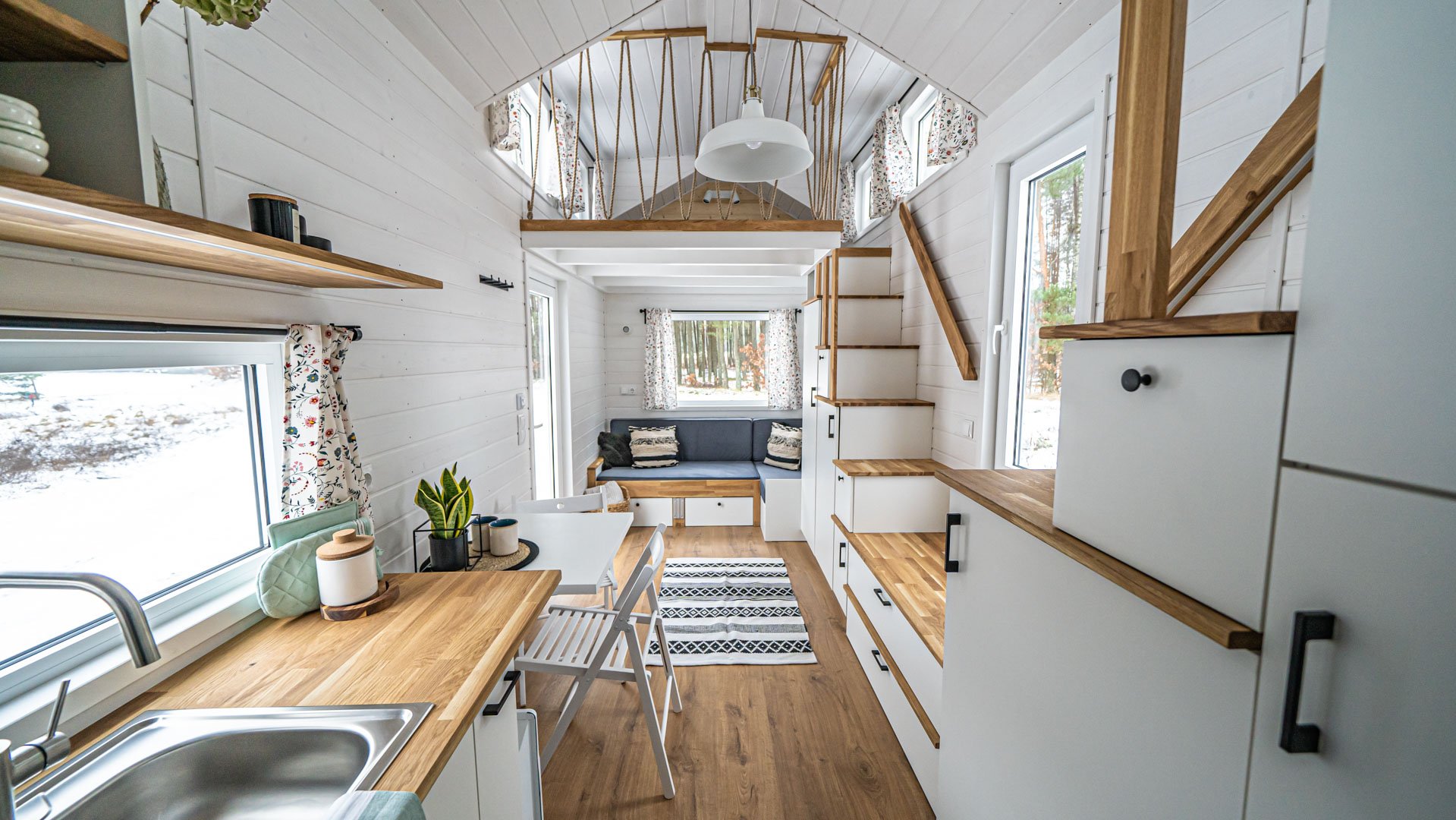
One European tiny house producer, Mobi House, does a great job of showing off their beautiful tiny houses. Not only do they describe each model in great detail including sample blueprints, accessories, and specifications, but the team also showcases each completed custom project with gorgeous pictures and often video walkthroughs. Doesn't it just look stunning?

Image: Mobi House Tiny House, Model Marigold (2022)
Be sure to display them in an easy-to-navigate, fast-loading slider or lightbox on your website, not as a single image that opens in the same tab and the visitor cannot scroll from picture to picture but rather has to hit the back button. To optimize loading times of these then image-heavy pages, be sure to optimize for user experience, e.g., setting them to "Lazy Load" rather than "Browser Default" so they get loaded when needed instead of all at once. Run your page through a Google Lighthouse performance test to get further optimization suggestions: https://developers.google.com/web/tools/lighthouse
4. Detailed Pricing Information
I know, I know. This is a sore point for so many companies. But let me ask you something: if you are considering making a considered decision (and purchasing a tiny house or deciding on a green company to build your passive house is certainly a big decision that requires a lot of research), and you have a lot of options you can research, which company are you willing to invest time and energy into learning more about: the one that gives you detailed pricing information on their website or the one with the button " Request A Quote"?
Your prospective buyers do not need to know the cost of every light switch but they do need to know the cost per square meter, what is included (shipping, construction, ...), what additional costs to expect, and so on.

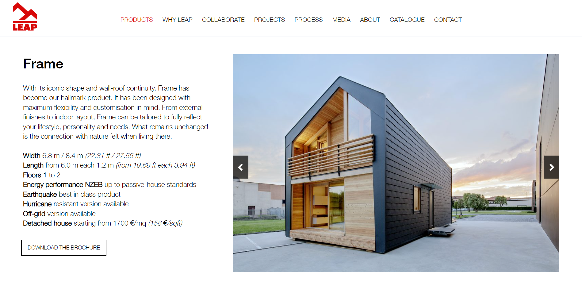
LeapFactory, an amazing Italian sustainable kit house builder, does a great job of providing the right level of pricing information on their website. Initially, you can the average cost per square meter or foot. When you download their catalogs, you get sample floor plans with detailed pricing information.
If you are a sustainable builder or offer tiny houses, I would be happy to give you some pointers on your website. Just book some time with me and I would be happy to help.
Share this
You May Also Like
These Related Stories

Why Modular Home Companies Need To Address Pricing On Their Websites (Incl. Examples)
4 Ways Any (Software) Company Can Talk About Pricing On Their Website

.png?width=250&height=125&name=TrustBuilderLogoWhiteTranspBackgr(250x125%20px).png)


No Comments Yet
Let us know what you think